


Drawing and Mark-Making Unit
SteamPunk BUGS
Objective
To develop drawing skills, the skills of observation, and practical aspects of visual art (research / gaining artistic inspiration from the Steampunk style), that allow you (the student) to incorporate new ideas into your own work.
Elements of Art and Principles of Design Focus:
Line / Value / Contrast / Shape / Form / Texture / Proportion
Inquiry / Discussion Questions:
Factual— How has “drawing” changed over time?
Conceptual— What is style?
Debatable— Is craftsmanship more important than product?
What artists can be considered influential with their drawing and mark-making?
Students will be assessed in these 4 areas:
Knowledge and Understanding (research tasks)
Developing Skills (drawing tasks)
Thinking Creatively (design tasks)
Responding (final outcome & reflection)
Students will:
- Be introduced to various mark-making and drawing techniques.
- Understand how to use pencil and drawing equipment to develop confidence and improve skills.
- Develop primary observation drawing skills.
- Advance at own pace; drawings can be made more complex and intricate based on individual students' skill levels. Students are encouraged not to hold back!
Language for learning
Through the activities in this unit, students will be able to understand, use and spell correctly, vocabulary relating to:
- form and shape, (rectangle, cycle, triangle, square, cylinder, sphere, cone, cube, ellipses, parallel lines, organic.)
- adjectives, (eg. bouncy, wavy, bumpy, curvy, straight, sharp, pointed, etc.)
- mark‐making, (eg. gestural, rendering, hatching, texture pencil, blending stump, eraser, etc.)
- tone, tonal, contrast (e.g. value scale, shades, variations, render, gradating, blending,
After this unit, most students will be able to analyze and comment on the way they approach the drawing process; make drawings of objects that show dimension, and experiment with different forms of mark-making.
Process Journal & Creative Output
Follow instructions and complete all drawing exercises to the best of your abilities. Drawings must be done in your Process Journal. Drawing exercises may be worked through at your own pace, do not proceed to the next exercise until you have had your work checked by the teacher & against the rubric, to see if you are in line to receive the best possible grade for your work!

Part 1.
Drawing Techniques: Value | Form | Texture
By using various hand positions and shading techniques, you can produce a world of different stroke shapes, lengths, widths, and weights in pencil. It’s also important to notice your pencil point. The shape of the tip is as essential as the type of lead in the pencil. Experiment with different hand positions and techniques to see what your pencil can do.
Writing Position: This familiar position provides the most control. The accurate, precise lines that result are perfect for rendering fine details and accents. When drawing in this position, place a clean sheet of paper under your hand to prevent smudging.
Underhand Position: This position allows for a free stroke with more arm movement, much like a painting motion. To draw in this position, hold your hand over the pencil and grasp it between the thumb and index finger. Allow your fingers to rest alongside the pencil. You can create beautiful shading effects from this position.
Moving from Shape to Form: The first step in creating an object is establishing a line drawing or outline to delineate its flat area. This is known as “shape.” The four basic shapes, the rectangle, circle, triangle, and square, can appear to be three-dimensional by adding a few carefully placed lines that suggest additional planes. By adding ellipses to the rectangle, circle, and triangle, you give the shapes dimension and begin to produce a form within space. The shapes become a cylinder, a sphere, and a cone. Add a second square above and to the side of the first square, connect them with parallel lines, and you create a cube.
Creating Value Scales: Artists use scales to measure changes in value and to gauge how dark to make dark values and how light to make highlights. Value scales also serve as a guide for transitioning from lighter to darker shades.
Task 1. Follow the Value Reference Sheet to the left, and create your own value scale and 3D forms in your process journal. Making your own value scale, and applying this technique to form, will help familiarize you with the different shade variations and give you a sense of how to create 3-dimensional looking drawings.
Determine where your light source is coming from (e.g. from over your left shoulder). Where you imagine it hits your object, you will put the lightest value. We will discuss all of this in lessons!
Basic Drawing Techniques & Creating Texture

Task 2.

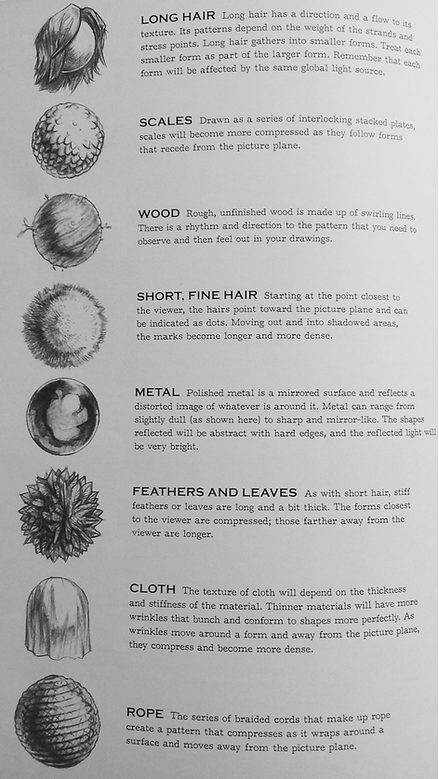
Task 2.
Texture Spheres
Use a compass, or trace around something round, the approximate size of the circular shapes on the left. Create a 4 x 3 grid of them in your process journal. You can orientate the page landscape or portrait, whichever you decide.
Using the examples given, or finding / creating your own, create 12 textured spheres. Try and incorporate your knowledge of creating a 3-dimensional effect, from task 1.
Part 2: STEAMPUNK INSPIRATION
Steampunk has its roots in the 19th-century Industrial Revolution. In the early 1800's everyday people were beginning to manufacture steam-powered machines and technology. This time was also known as the Victorian era.
Task 3. Spend about 20mins doing some research / reading about the Steampunk style. Make some notes in your process journal as you research, notes can be bullet points and can be facts and descriptions about this style. Try and focus on points that can be related to objects, more than people.
Make a note of the website addresses where you get the information from.
Cogs and Gears

Steampunk gadgetry is known for its combination of form and function.
Task. 4
Draw 2 cogs (sometimes called gears) in your process journal. That's 2 circles... so use a compass, or find something round to trace. Draw the "teeth" on your cogs. Take inspiration from the image on the left, or look up some images of cogs and gears online. Use different pencils e.g. HB, 2B, 4B, 6B. Try and create different values, to make your cogs & gears look 3 dimensional, use your prior knowledge from Task 1.
You are not limited to drawing 2, this is the minimum. You could develop your drawing to include more cogs and gears, a Victorian-era clock face, and other mechanical parts. The more effort you put into your work, whether that's through the expansion of your ideas, and/or craftsmanship, the higher grade you will receive. Don't forget to refer back to the assessment rubric after each task, to see if your work is in a good position to get a good grade!
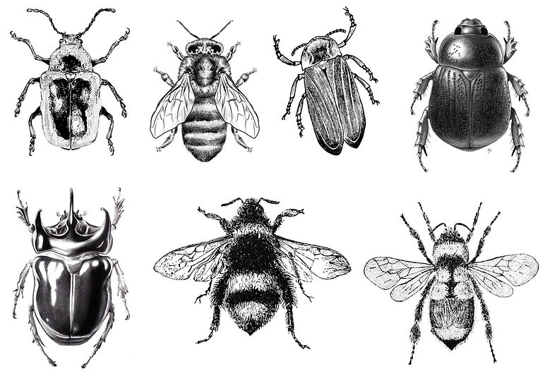
BUGS - Observational Drawing -
TASK 5: Complete an observational drawing of a realistic-looking bug, from a 'birds-eye perspective'. 'Below you have 7 bugs to choose from. Choose one, and copy it into your process journal. Study it closely. Flick your eyes back and forth as you draw it so that you can translate all of the information (details) into your drawing. Pay attention to values, texture (mark-making), form, and symmetry. Your aim is to make it look realistic and 3 dimensional. Sketch lightly at first with pencils like 2H & HB, slowly working up to the darker values and using pencils such as 4B & 6B.
Part 3. STEAMPUNK BUGS

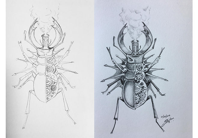
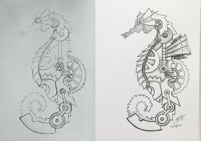

TASK 6
Final Drawing
Combine all of your new skills to create a Steampunk inspired animal.
You can use your realistic bug as a starting point, or select a new, (realistic looking drawing), of an animal that inspires you when you think about merging it with the steampunk style.
You can also copy one of my example drawings. Try and adapt it in some small way, add something new into it / make it your own.
Step1. With either a 2H or HB pencil, lightly sketch the main shapes of your animal onto a new page in your process journal. Take care to scale the animal so that it's an appropriate size for the page, i.e. not too tiny, nor too big where you run the risk of it not fitting on the page. You can choose to turn your page either landscape or portrait.
Your aim at this step is to very lightly sketch the animal and most of its details in line only, with no shading. (See my example drawings).
Step 2. You will select an area of the animal to erase out, and draw in some cogs & gears, and anything else steampunk mechanical that you feel confident drawing. To add a pipe that emits steam is going to be a great way to link your drawing to our steampunk theme! Be creative in your design, and have fun with it. Try and have it "make sense" e.g. larger cogs for larger areas of the animal's body, smaller cogs for smaller body parts, etc. You do not need to design mechanics for the entire body (but you could!!), you can select half the body only if you want. See my drawings for inspiration.
Step 3. Pick up a 2B pencil and begin to work on your mid-tone values, leaving the areas of lightest value the white paper, for now. As you shift towards the darker values in your drawing, you can experiment with darker pencils 4B, 6B, and 8B. Your aim with the shading is to create a 3D-looking, realistic form. Constantly refer back to your source images (pictures that you are working from), don't "make up" the shading.
Tips:
- Keep an eye on the sharpness of your pencil. With high detailed work, you will find that you'll need to sharpen your pencil often.
- Try not to use your eraser when drafting your initial drawing, (we will discuss this in class), sketching very lightly is the key here. You will use an eraser to 'lift out' very light areas of your drawing at the end, to show the lightest values, like reflections on shiny surfaces.
Read and follow some of the expert's tips from this artist's page with the cool mechanical spider.
Part 4: Critique, Reflection & Final Assessment
Verbal Critiques: We will do a pair review, followed by a class critique of your work.
Written Reflection: You will write a reflective paragraph in your process journal, using prompts given by the teacher.
Final Assessment using Rubric: Students will hand in their process journal for grading. The teacher will grade using the assessment rubric given at the beginning of this unit of work.

Paper-Cutting Collage Unit
NOTAN
UNIT
=NOTAN= is a Japanese design concept involving the play and placement of light and dark as they are placed in harmony next to each other.
This use of light and dark translates shape and form into flat shapes on a two-dimensional surface. Nōtan is traditionally presented in paint, ink or cut paper but it is relevant to a host of modern day image-making techniques, such as lithography in printmaking, and rotoscoping in animation.
Project Objectives:
- To understand and use positive and negative space in an interesting way.
- To use a 6x6 square of black paper and all the negative cuttings to create a Notan collage design.
- To understand and use symmetry and asymmetry in the notan design.
- To understand and use the elements of art: space and shape (positive and negative).
- To understand and use the principles of art: contrast and balance
Inquiry Questions
Factual - How does Notan transform?
Conceptual - What do you think the meaning behind Notan might be?
Debatable - Does art have boundaries?
Students will:
- Understand how to recognize and manipulate positive and negative space; symmetry and asymmetry, balance; shape and space.
- Create a series of 2D Notan designs.
Process Journal & Creative Output
- Create two Pages in your Process Journal introducing Notan and its principles, and showing a variety of examples.
- Creative Output: Create two successfully created black and white Notan on paper. Then, create a more complex Notan using a pre-existing image that takes into account the color and patterns that already exist within the image.
Total work output = 2 process journal pages, 3 artworks on paper, reflection & critique.
Expectations: You must be cooperative and supportive within the art studio to help create a good
environment - comment critically on others work and comments. You must listen actively and endorse the views or opinions of others during presentations and discussion of research.
Check list:
- Did you successfully create a couple of Notan designs using white paper and black card?
- Did you understand the process and what Notan is, demonstrating this knowledge in your annotations ?
- Did you try a more complex Notan using an image, and did you take into consideration the colour and
patterns that existed in that image?
- Do your two research pages demonstrate an understanding of how to recognize and manipulate positive and negative space; symmetry and asymmetry, balance; shape and space?
- Have you actively participated in class discussions?


Local Dallas artist - Wheron
"Will Heron established the art alias and collective “Wheron” in 2012 for both public street art and gallery exhibitions. Reflecting on his Dallas roots, Heron’s 2D mixed-media works fuse southern imagery and visual wordplay to create prickly, illustrative, high-contrast compositions. The core of his current art practice thrives on creating giant public murals, facilitating dynamic interactions among the individual viewers, their community, and his large-scale street art. Public mural works by Wheron can be spotted across the DFW metroplex – from Oak Cliff to Fort Worth to the Historic Downtown Plano. Most recently, Wheron was selected as a headlining artist for the HUE Mural Festival in Houston, TX in November of 2017.
In addition to creating over 20 public street art works, Wheron has exhibited at Erin Cluley Gallery, Fort Works Art Gallery, East Field College, Safe Room Gallery, Rockport Center for the Arts, ATAMA Gallery, and the Oak Cliff Society of Fine Arts."
“Fine Art.” Wheron, Will Heron, 2012, www.wheronart.com/fineart/.
Let's discuss Wheron's work using our art language, (the elements of art and the principles of design), as well as, our prior knowledge of Notan.
Task: Choose a basic plant or animal shape. We will experiment with cut outs of this shape, collage and paint, to create a Wheron inspired artwork.


Painting Unit
Watercolor Cakes

Wayne Thiebaud
Who is he?
Task 1. Research (knowledge & understanding criterion).
Create a page (one page min.) in your process journal that is dedicated to this artist.
Page should include images of his work and relevant information about this artist.
Images of his work can be printed, or you can draw one (or some) of his cake paintings.
Relevant information includes:
- Year he was born.
- Where he lives (important places he resided).
- When and how he came to art, did he have another occupation first?
- Why and how did he become well known?
- Is there a movement of art that he is associated with?
- What are his most well known works?
- Describe his works in detail (ie. talk about scale, color, technique).
What medium did he work in?
Wayne Thiebaud is an American painter best known for his still lifes of edible treats and everyday objects in his singular illustrative style. His most popular subject matter includes colorful cakes, slices of pie, candy pieces, such as lollipops, and the winding streets of San Francisco.


LINOCUTS
Purpose: To teach you how to make a linocut.
What is a Linocut? Linocuts are very similar to woodcuts. It is a printing method using a sheet of linoleum, in which a subtractive cutting method is used to take away the parts of linoleum where you want to leave the white of the page, and keep the parts you want to be inked! In the result you have a linocut that can reproduce the same image over and over again.
A Short History: While linoleum was first invented in the 1860s, it wasn't used as a medium for printing until the early 1900s in Germany, where it was first used for making patterns on wallpaper! Artists ranging from Pablo Picasso to Henri Matisse have made linocuts, and today it is considered a respected art form. Linocuts are also very popular in teaching children in schools about the rewarding art of printmaking.
Why linocuts? First off, linoleum does not have a grain like wood does, meaning there is no need to cut in one direction. Also, it is much, MUCH easier to cut than wood, especially when heated. Although linoleum is not quite as durable as wood, you can still make hundreds if not thousands of copies of the same image with a single linocut before it is too degraded to use. Linocuts generally remind me of illustrated children books. One can even make several linocuts to be used together to make a print including color, and in some cases (depending on the ink and paper you use) a linocut print can be colored after wards with your medium of choice.
1. Gather your materials.
• double-sided linoleum blocks
• carving tool with interchangeable blades
• printing ink or paint
• brayer or roller
• smooth surface for rolling out ink; e.g. a piece of glass from a picture frame and taped an edge with painter's tape for easy handling.
• pencil and marker for sketching design
• cardstock or printmaking paper
2. Draw your design. Don't forget that your print will be the mirror image from the block, so keep this in mind if you incorporate type into your design. Some people prefer to take a permanent marker and shade in all the negative space so it's easy to tell what gets carved out and what stays. I opted to just sketch with pencil and go for it!
3. Carve out the negative space. Your carving tool will come with a variety of blade shapes, and they'll carve out lots of different tracks — some skinny and narrow, some wide and shallow — so choose a blade and start carving! Always carve away from your body and fingers, and try for a level, even cut — start with shallow cuts and get the feel for your substrate, and try not to dig too deep all at once.
4. Pour out a small amount of ink onto a clean surface. Once you're ready to start inking, start with a small amount on your glass.
5. Roll out ink with your brayer until it is smooth and velvety. Roll the ink until you feel like it's coating your roller evenly; it may take quite a few strokes!
6. Roll a thin layer of ink onto your block. Be sure to cover all of the design evenly.
7. Use steady pressure to lightly press cardstock onto your block. There are lots of ways to transfer ink to your paper — you can experiment and see what works! Try rolling a dry brayer over the paper to evenly distribute the ink, or place the paper on the table and press the inked design face-down onto the paper instead. I just used my fingertips to rub light circles over the whole block. Don't worry about getting the design perfectly straight — you can always trim off excess paper after the ink is dry.
8. Carefully remove the paper from the block. You may find that the very first print you make is less than perfect… don't give up! It may take several tries to make a print you're happy with. You can go back at this point and carve more from your block if needed… and don't forget — part of printmaking is embracing the imperfections.
9. Let the print dry thoroughly, and enjoy!
10. Rinse ink off, let dry, and repeat. The neat thing about printmaking is the ability to make lots of copies.
Formal Critique
Evaluating the effectiveness of your artwork and the printmaking
process.
Vocabulary
Relevant art elements and principles of design to include when writing your
reflection - line, shape, space, movement, balance, harmony, contrast, scale,
symmetry/asymmetry, proportion, cropping, repetition, pattern, sequence, emphasis
Materials: Cartridge paper for the prints, printing ink, brayers, trays for rolling out the ink, newspaper to cover the tables, piece of lino, lino carving tools with a variety of
blades.
Reflective questions to answer in your process journal in full sentences:
What did you think about this type of printmaking process, what media and
techniques were used?
What do you think about your piece? Did the use of visual qualities in your design
suit the media? Use the given vocabulary - talk about visual impact, movement
created, about balance, about shapes and color choice – what works and does not
work and why.
What do you think about your peers work?
Make some comments about the printmaking process itself as well as collaboration in art-making - did you need others for this project? Would your work have been stronger if you had helped each other more?
How could you develop the artwork further to become more aesthetically effective?
You could use the familiar art dept. reflection prompts Adapt, Adopt, Address,
Reinforce, Reflect and Rethink to frame your answers to the questions above.

UNIT
FANTASY BUILDINGS IN ONE & TWO POINT PERSPECTIVE

Many artists are very interested in making two-dimensional artworks look three-dimensional. During the Renaissance, artists used mathematics and close observation to invent "linear perspective"- a technique that helps artists make things look three dimensional. This lesson will teach the basics of drawing forms in two-point perspective. You can then transform your drawings into fantasy buildings. In this lesson you will also plan "City Streets in One- Point Perspective" which covers much of the same content but teaches one-point perspective techniques.
Vocabulary
• linear perspective
• one-point perspective
• two-point perspective
• horizon line
• vanishing point
• orthogonal lines
• horizontal, vertical, diagonal lines
Architecture - The Built Environment
Do you think there is beauty in the city?
Do we all have the same point of view?
You will learn how to…
Express your ideas and feelings about buildings, explore your experiences of walking through spaces, look and discuss the work of architects and designers, and draw some basic building plans.
Here is some of the language you will need to know…
• sensory experiences of buildings, e.g. sounds, echoes, temperature, scale, proportion, materials
• composition, e.g. viewpoints, perspective, shape, pattern, texture, form, proportion, scale, angle, curve, two-dimensional
• architectural detail, e.g. doorway, arches, windows, porch, courtyard, architrave, stanchion, gate, carving, moulding
• sculpture, e.g. ceramic, slab-building, coiling, kiln, firing, construction, oxide, three-dimensional, relief, scale, angle, edge, profile, texture, space, shape, curve, carved
Step 1. Research any meanings to the vocabulary above that you do not know.
Step 2. Research; begin to collect information about BUILDINGS… choose two iconic buildings that you know about, one must be Brazilian and one must be from a foreign country. Print some images, do some sketches of the buildings, note the construction dates and architects… and any other interesting pieces of information.
Artist Inspiration 'Sarah Morris'
Athos Bulcão
Brussels - Eco Building
Extraordinary & Sustainably feets of architecture
France makes new eco building law

ONE POINT PERSPECTIVE


Henri Matisse
Watch this...

Task 1 - Read the text below - type out 6 things you learned about Matisse, that you thought were interesting. These can be in point bullet form & should be entered into Schoology in your Task 1 - Matisse. section
A Story About Henri Matisse
Henri Matisse was born in France in 1869. His father sold seeds and grain and his mother was a dressmaker. At the age of twenty, Henri was studying to be a lawyer when he became very ill. He had to have surgery and was bedridden. Henri was very bored just lying around so his mother gave him a box of paints and brushes so he would have something to do. When he recovered he did not want to go back to law school, instead, he went straight to art school!
Matisse was so good at painting that the school didn’t help him so he decided to open his own school and show other artists how he painted. Art critics thought Henri and his friends painted like “Fauves” (a French word for wild beasts) because they used bold bright and unusual colors. Critics thought the “Fauvists” would never be successful artists, but they were wrong. Henri Matisse worked on his art for over 60 years and became one of the greatest artists of all time! Throughout his lifetime, he suffered from poor health, but that never stopped him from creating art! Many pictures were painted from his sickbed so they show the inside of his room and a view of the outdoors through an open window, the rooms had patterned wallpaper, curtains, tablecloths, and many everyday objects, there was so much to look at in Matisse’s pictures! He used rich colors and shapes and loved to paint people too. Henri was also known for trying a new style by painting paper and then cutting it out and pasting it into the painting.
Matisse was married and had three children. He loved to travel and explore other countries and often was influenced by those cultures and their folk art. He died in 1954 he was 85!
“To find joy in the sky, the trees, the flowers… There are always flowers for those who want to see them.”
– Matisse
Henri Matisse Biography
Henri Matisse was born on December 31, 1869, in northern France. As a young man, he went to Paris to study law, graduated, and in 1889 returned home to work as a clerk in a law office. It was at this time that he had an acute attack of appendicitis, requiring surgery and a long convalescence. His mother gave him a paint box, and at the age of 21, Matisse discovered painting. He returned to work, and every morning before work, he attended drawing classes; at lunchtime, he would paint for an hour or so and then return to work. After work, he would paint till night fell. It was his life.
In 1891 set off for Paris. Despite that one of his first teachers told Matisse that he would never learn to draw, he worked hard and was sponsored as a candidate for the school for fine arts. He failed the entrance exam and enrolled instead in an evening school. He later joined the studio of symbolist/Mannerism painter Gustave Moreau, who encouraged the young Matisse “to look inward.” Matisse began his journey of studies which ultimately lead him to merge his love of the work of the old masters, his weakness for ornament, and his love of line, shape, and color.
Matisse felt that his greatest influence had been the work of the artist Cezanne (1839 – 1906, French).
In the 1950s, Matisse began creating paintings using paint and paper cut-outs. He produced many paintings and designs using this technique.
In his last years, as he aged and fell ill, Matisse continued to paint, this time on the walls of his room, using a piece of charcoal attached to the end of a bamboo pole. He painted until his death in 1954.
Matisse had strong feelings about only one thing, the act of painting. This to him was an experience so profoundly joyous that he wanted to transmit it to the beholder in all its freshness and immediacy. The purpose of these pictures, he always asserted, was to give pleasure.
For Matisse, painting was the rhythmic arrangement of line and color on a flat plane. He had created the technique of striking contrasts, unmixed hues, flat planes of color (similar to Gauguin, 1848 – 1903, French) and expressive brush strokes (similar to Van Gogh, 1853 – 1890, Dutch). Light was expressed, not in the method of the Impressionists, but with a harmony of intensely covered surfaces.
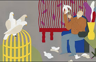
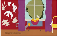
Task 2 - Look-up some of Matisse's paintings on google images. There are also some displayed below, if you hover your cursor over one and then wait for a second, the title will show. Note: these images are cropped, so if you like one, you should copy the name into google to search to see the whole painting. Your task is to do a little study (copy). You can choose a section (close-up) of part of the artwork, e.g. you could just do the goldfish in the bowl. It can be whatever scale you like, big or small. You can use whatever medium (pencil, paint, pen, paper) you have at home and whatever colors you have available. You will upload this into Task 2. Mattisse Pinboard Gallery & Critique Board. Make one positive comment on someone else's work also, using the elements of art and principles of design.
 |  |  |
|---|---|---|
 |  |  |
 |
Task 3. Matisse Cut-outs
This task should take you 2.5 fine art's blocks, that's one week, plus you'll do your end of week check-in this Friday.
Tues. you should prepare your materials. If you have colored paper you can use that. If you have paint and white paper you can use that. If you have neither but have markers and paper, that could work. If you have none of the above, email me and I can send you some. Watch the video to the left, the entire way through, you can snack while you watch it, it's about 13mins. Go get those cookies! Then prepare your colored paper. Sketch-in the basic shapes, and either cut them out or wait until Wednesday if you need to let the paint dry.
Wed. you can begin to cut out and arrange your objects. After watching the video you should have a good idea of what to do. It can take on its own direction. You can be creative here. You can even look-up other Matisse cut-outs and get inspiration from those to add to your work. You can create one or two works, I will grade the best.
Aim for an interesting composition (arrangement) and colors that are either complimentary or analogous.
Upload a photo to Schoology task 3. when you're done.
Leave one positive comment on another's work.
Task 4.
Let's go to Paris, France! Home of Matisse.
Today you will explore the Musée d'Orsay.
Click here
Scroll to the bottom of the page and enter the circle where it says 'Explore'.
Your task is to look around the art museum, go into the different rooms and investigate the art.
With a bit of exploring the site features, you will find that at times a painting's name with more information might pop up on your bottom left of the screen. I want you to choose your favorite painting from today, take a snap-shot of it, record the name & artist, and upload it under task 4 in Schoology.
Task 5. Still-life
Look around your house and find an odd number of objects, of different sizes but all need to fit on a table e.g. 3 or 5 objects, one tall like a vase, one medium like a book, one small like a piece of fruit. Set-up your still-life in a place where it can remain for a couple of days.
Next, take a comfortable position about three feet back so that you can view your still-life well.
Tip: Placing it near a window, or a lamp can aid in creating some strong shadows to draw, also, use a large hardcover book to put your paper on to press against when drawing.
Matisse is our artist role-model, so ensure that you use bold colors! Also, experiment with color e.g. the table that your still-life is on does not have to be painted the same color in your artwork, it could be pink or bright yellow!
You can use whichever media you have at home: paint, colored pencils, pastels, markers. Upload your work here when finished and leave one positive comment on another work using our art vocabulary.
Task 6 - Matisse's Garden
This week you are going to build on your skills from Task 3 and create a piece of art titled ‘Matisse’s Garden’. The inspiration comes from both a book by this name, our current quarantine situation, and this quote “One day the artist Henri Matisse cut a small bird from a piece of white paper. It was a simple shape but he liked the way it looked and didn’t want to throw it out. So he pinned it on the wall of his apartment to cover up a stain.”
You are going to spend Tuesday cutting a number (as many as you can in your Fine Arts block) of Matisse inspired shapes (inspiration for what kind of shapes is below, also click on the link to the book).
Then during Wednesday’s Fine Arts block (with your parents’ permission), you will select a window in your house and use a glue-stick or, clear tape, to arrange the shapes into a picture / compose them.
Take a photo of your window when you’re done, and upload it to Schoology by Friday.
Remember to leave a positive comment on someone else’s work using our art vocabulary. Key art elements and principles of design for this task will be… Shape / Line / Pattern / Repetition / Color.
Note: I expect to see a picture with some kind of a narrative (story), e.g. birds flying across a sky / people dancing / a garden - use Matisse’ ideas as inspiration for yours.
Materials: You will need a selection of colored paper, glue, and scissors. If you do not have colored paper, you could use colored sections from magazine pages or newspaper if need be. Email me if you have any concerns about the materials.


BBC Modern Masters - Matisse
Task 7.
Watch the 'Modern Masters' documentary on Matisse to your right.
Only watch up to minute 23:23.
Then stop the documentary and go back to Schoology and complete the 10 question quiz!